Reporting Data 101: Turning around Reports Quickly with RMarkdown and LaTeX
I happen to have a lot of knowledge working in R and LaTeX left over from the days when I thought I would be an academic, so when I needed to automate a weekly report, they fit the bill.
At work, my team often gets requests to put together reports that will go out on a regular basis. These can be daily, weekly, and even monthly, and for a variety of reasons, we usually only get a week or two's notice in advance. To make matters more difficult, many of the folks we send reports to primarily work on mobile devices, and would have no easy way of accessing a website with a dashboard or digital report hosted on our intranet.
For reports we know will need to go on for a long time, historically we would create BIRT reports which users can run on demand with parameters they choose and can also export to PDF for e-mail distribution. Unfortunately, BIRT reports are quite difficult to create and maintain. In theory the drag and drop interface of the report designer allows anyone who knows SQL to create reports, but in practice creating reports requires a lot of esoteric knowledge about all the different BIRT quirks to make them (e.g. multiselect parameters return java arrays, but you need to convert them to a format suitable for JavaScript to interpret to insert them into a query). BIRT reports are also quite ugly out of the box.
The other alternative is creating the report in Excel. This is by far the fastest turnaround option for something usable, but once you need to make report formatting slightly more attractive, Excel gets frustrating very quickly. More to the point, it is also much more of a hassle to automate a full data pipeline that ends in an Excel report.
With all that said, there are a lot of options available to analysts who need to put together something like this. Jupyter notebooks and Jinja2 templates could fit the role, or even Weasyprint. It is worth reiterating that we are creating a static report here, not a dashboard where tools like Streamlit or Shiny (interactive dashboard/web app tools) would be better solutions.
I happen to have a lot of knowledge working in R and LaTeX left over from the days when I thought I would be an academic, so when I needed to automate a weekly report, they fit the bill.
Prerequisites
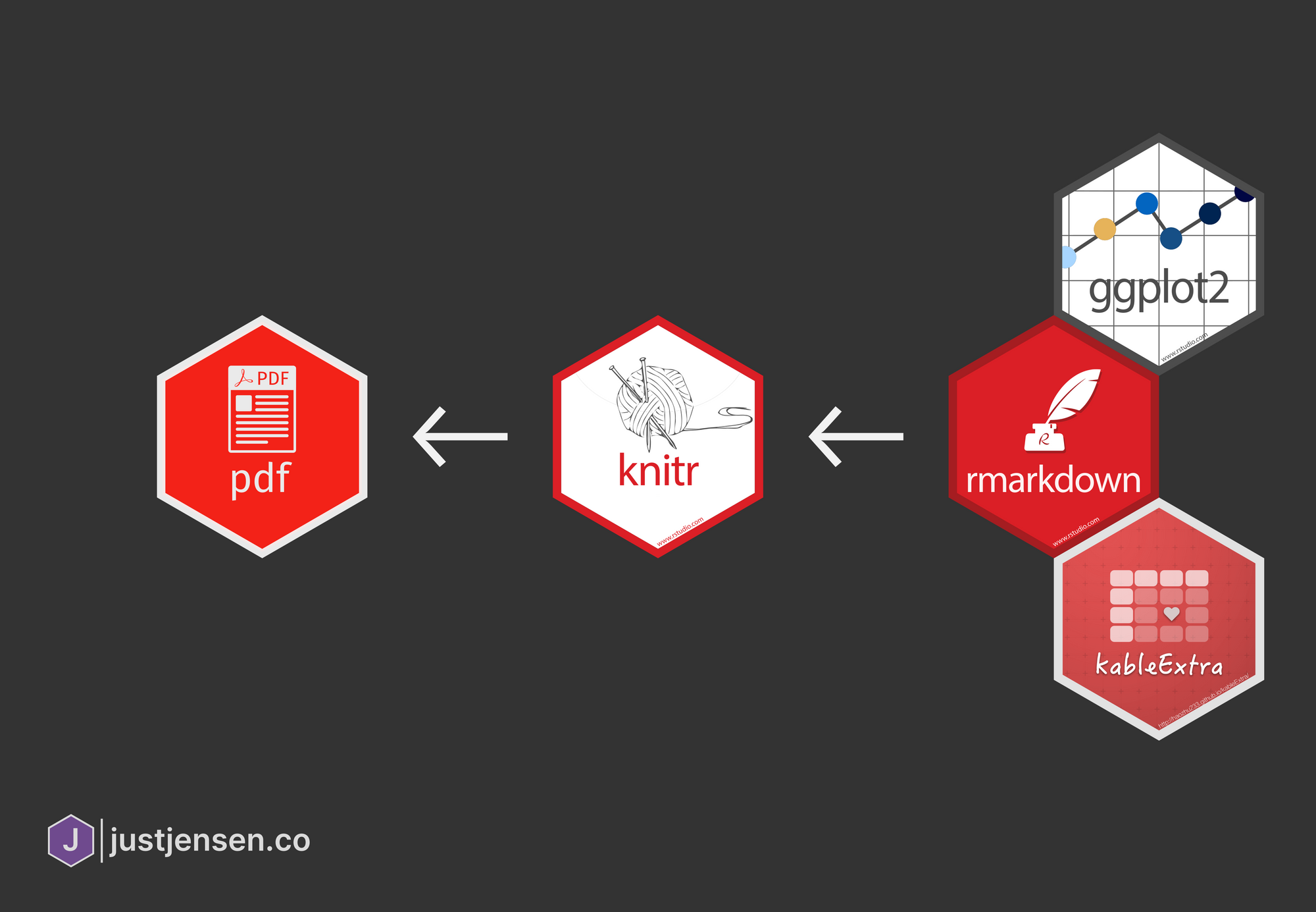
To put together the reports, you will need to make sure you have the following programs and packages installed/downloaded:
- R (tested with version 4.0.2)
- rmarkdown
- kableExtra
- ggplot2
- RStudio (tested with version 1.3.1073)
- Pandoc
- LaTeX (via MiKTeX or TeX Live)
- If you have a strange proxy setup that will make installing packages more difficult (as I do at work), install TeX Live Full, which contains all packages (but will take up 5 GB of space)
- The Eisvogel LaTeX Template
I know this is a lot to set up, but in the end everything will stitch together to seamlessly to create an attractive final report. Is there an easier way to do it? Almost certainly.
Putting Together the Report
Even though the report we put together is just a demonstration, we need a data set large enough that we can put together something worthy of automating. The data set of Washington D.C. parking tickets from January 2020 fits the bill.
Knitr (the dynamic report generation engine that RStudio uses) generates a Markdown document that it then runs through Pandoc. Pandoc markdown allows users to add in extra parameters through a metadata YAML block at the top. There is a lot to get through, so if you want to learn more about RMarkdown's notation, check out the official documentation. While you can create templates that accept other parameters as well, let us create a standard metadata block for now:
---
title: "January 2020 Parking Violations"
subtitle: "Parking Tickets from Washington D.C.'s Open Data Site"
author: 'JustJensen.co'
date: '`r format(Sys.time(), "%e %b, %Y")`'
---In the example above, title, subtitle, and author should all be fairly straightforward. For the date, it is possible to execute R code directly in the metadata block to set it automatically. The R code here grabs the current day's date, and outputs it as the day, three letter month, and year (if it is September 15th, 2020, the code above would output date: '15 Sep, 2020').
In between code blocks, you can write your text as mostly standard Markdown:
This is a paragraph in an R Markdown document.

Below is a code chunk to grab the API data:

```{r}
# Download the data
url <- 'https://opendata.arcgis.com/datasets/009dedfbaf364905a8e25181b3490cd9_0.geojson'
destination_file <- 'january_2020_dc_parking_tickets.geojson'
download.file(url, destination_file, 'curl')

# Prepare the data
df_violations <- read_csv(destination_file)
colnames(df_violations) <- tolower(colnames(df_violations))

df_violations <- df_violations[c('objectid', 'issue_date', 'issuing_agency_code',
                                 'issuing_agency_name', 'issuing_agency_short', 'violation_code',
                                 'violation_proc_desc', 'location', 'disposition_type',
                                 'disposition_date', 'fine_amount', 'total_paid', 'latitude',
                                 'longitude', 'mar_id', 'gis_last_mod_dttm')]

```

The slope of the regression is `r b[1]`.
Using the fenced code blocks (with ```{r}...) you can execute chunks of R code, and can even use an inline code block to print out a variable value. If you want to output Markdown from an R code block, you can use the cat function:
```{r}
cat(paste('#', 'This is a heading for Object', df_violations$objectid[1], '  \n'))
```
# This is a heading for Object 18624665
Now that we have learned a bit about the basics of putting a report together, we need to start introducing tables and charts as well.
Using ggplot2 to Create Automated Charts
While this isn't meant to be a tutorial on how to put together attractive charts with ggplot2, one of the big advantages of creating automated reports with RMarkdown is access to all the great visualization tools available in R. While there are other libraries available if you want to put together RShiny dashboards which are interactive, ggplot2 is very capable of making attractive static charts for PDFs. If you want to learn more about ggplot2, check out the official book or my somewhat outdated post on adding an attractive footer, but for now we will put together a chart of tickets per day.
# Start by counting the number of violations per day
df_violations$issue_date <- as.Date(df_violations$issue_date, format='%Y/%m/%d')
df_violations_per_day <- df_violations %>% count(issue_date)

# Plotting
plt <- ggplot(df_violations_per_day) +
  geom_hline(yintercept=0, size=0.4, color='#3C3C3C')+
  geom_line(aes(x=issue_date, y=n), color='#6f4a8e', alpha=0.8, size=1) +
  geom_point(aes(x=issue_date, y=n), color='#6f4a8e', alpha=0.8, size=2) +
  labs(x='', y='', title='Parking Violations in Washington D.C. drop off on Weekends',
       subtitle="Daily Parking Violations in January 2020 from D.C.'s Open Data Site") +
  scale_x_date(date_labels='%b %d', breaks=seq(as.Date('2020-01-01'), as.Date('2020-01-31'), by='weeks')) +
  theme(text=element_text(size=12, color='#3C3C3C'),
        plot.title=element_text(hjust=0, size=rel(1.5), face='bold'),
        plot.subtitle = element_text(hjust=0, size=rel(1.1)),
        plot.caption=element_text(hjust=0),
        plot.title.position = 'plot',
        plot.background = element_rect(fill='#F0F0F0'), axis.ticks=element_blank(),
        panel.background = element_rect(fill='#F0F0F0'), panel.grid=element_line(color=NULL),
        panel.grid.major=element_line(color='#d2d2d2'), panel.grid.minor=element_blank(),
        strip.background=element_blank(), strip.text=element_text(face='bold'),
        plot.margin=unit(c(1,1,1,1), 'lines'))
print(plt)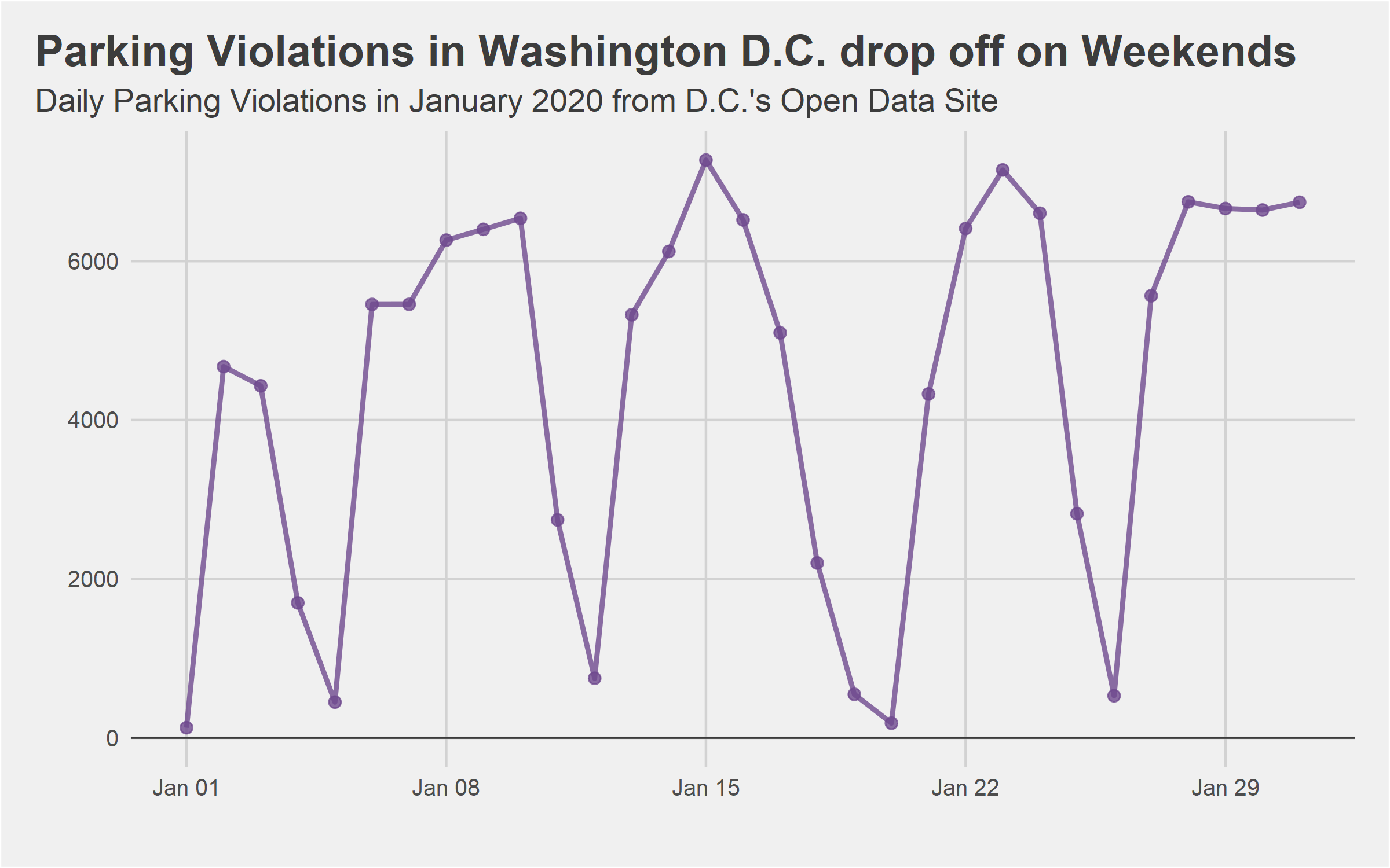
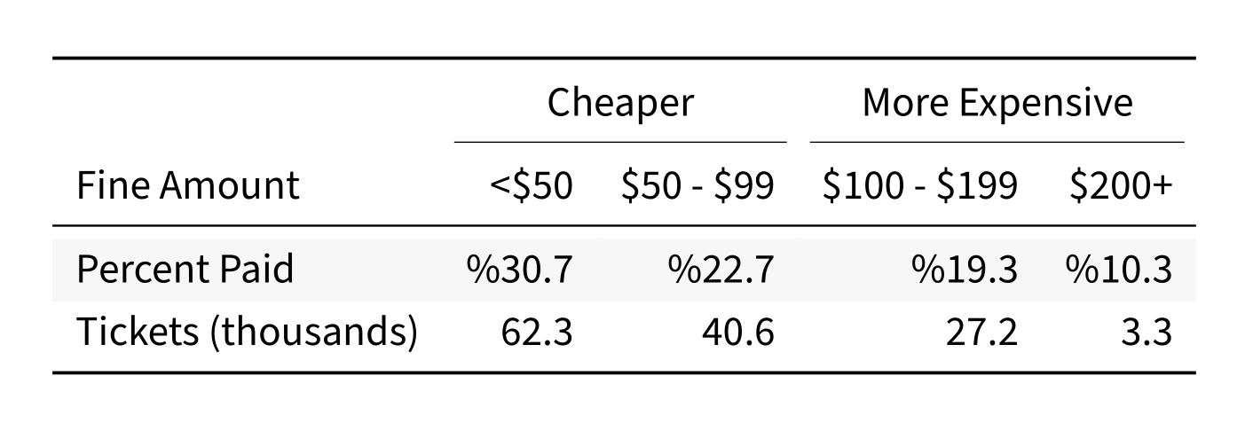
Using kableExtra to Create Automated Tables
Once again, while there are many other options available for making HTML tables, kableExtra is the best combination for PDF tables of attractiveness and straightforward syntax. The upcoming library with the most promise seems to be gt, although I have seen blog posts with impressive examples from reactable as well. The first thing we will need to do is update the YAML block at the top to make sure the correct packages get included:
output:
  pdf_document:
    extra_dependencies: ["booktabs"]
Now we need to create the kable object and print it. Knitr will convert the table output to a code bock unless you set results='asis' in the block definition.
library(kableExtra)
df_violations$fine_paid <- ifelse(df_violations$fine_amount==df_violations$total_paid,
                                  1, 0)

df_violations$fine_bin <- case_when(
  df_violations$fine_amount < 50 ~ '<$50',
  df_violations$fine_amount < 100 ~ '$50 - $99',
  df_violations$fine_amount < 200 ~ '$100 - $199',
  df_violations$fine_amount >= 200 ~ '$200+'
)

# Preparing the final dataframe for table generation
df_violations_fines <- df_violations %>%
  drop_na(fine_amount) %>%
  group_by(fine_bin) %>%
  summarise('Tickets (thousands)'=round(length(fine_paid)/1000,1),
            'Percent Paid'=paste0('%',round(sum(fine_paid)/length(fine_paid),3)*100)) %>%
  gather('Tickets (thousands)', 'Percent Paid', key='value_type', value='value') %>%
  spread('fine_bin', 'value') %>%
  select(value_type, '<$50', '$50 - $99', '$100 - $199', '$200+')

colnames(df_violations_fines)[1] <- 'Fine Amount'

# Creating the table object and printing it
kb <- kbl(df_violations_fines, format = 'latex',
          booktabs=T, digits=1, linesep='', align=c('lrrrr')) %>%
  kable_styling(latex_options = 'striped') %>%
  add_header_above(c(' ', 'Cheaper'=2, 'More Expensive'=2))

print(kb)
Unfortunately, the output will have to be a screenshot for the post, but it looks very nice, even if the difference between cheap and expensive tickets is mostly for show.
Tying it all Together
The Eisvogel LaTeX template will be doing a lot of the heavy lifting to help make our report look attractive, and comes with a nice looking cover page as well. To use the cover page, you will also need your personal or company logo as a PDF, which is easy to do with an export from Inkscape or Adobe Illustrator. To use the template and activate the cover logo, edit the YAML metadata block to include the following:
output:
  pdf_document:
    keep_tex: true
    latex_engine: lualatex
    template: ./eisvogel.tex
    extra_dependencies: ["booktabs"]
    toc: true
titlepage: true
logo: "justjensen-logo.pdf"
titlepage-rule-color: "0039A6"
titlepage-text-color: "000000"
titlepage-rule-height: 2
toc-own-page: true
After updating the YAML block, you are now ready to knit the document together! Unless you chose TexLive Full as your LaTeX distribution though, the first run will not succeed, as you do not have the correct packages installed. You should either set MikTex to install missing packages on the fly, or use tlmgr to install the following packages to the texlive-latex-extra distribution.
adjustbox babel-german background bidi collectbox csquotes everypage filehook
footmisc footnotebackref framed fvextra letltxmacro ly1 mdframed mweights
needspace pagecolor sourcecodepro sourcesanspro titling ucharcat ulem
unicode-math upquote xecjk xurl zref
You can also try to compile the document using the TeX Editor of your choosing (like Texmaker) to force MikTex to prompt you to install each package. Once the packages are installed though, the Knitr button should work as normal. If you want to check out the resulting PDF, you can find it on the accompanying GitHub repository.
Using the report in Production
After replacing the input data, it is easy to run the rest of the report, creating the plots and tables automatically. Combined with a short script you have scheduled to run weekly to execute knitr and e-mail out the report, it is "easy" to fully automate your reporting pipeline, as long as you trust your data validation upstream. In my case at work, we are working somewhat directly off of GPS sensor data, which means the report still needs a quick review each week. Before putting together the PDF, you may also want to hide the code blocks and any other messages/warnings by setting message=FALSE, warning=FALSE, and echo=FALSE in each code block, or in the Knitr setup chunk.
Assuming you already know R (including ggplot) and maybe a hint of LaTeX, the whole process really is an easy way to spruce up a recurring PDF report without diving into Adobe InDesign or Scribus.