Making Population Density Maps with Rayrender in R
On Mastodon recently, I came across some really cool work from @terence@fosstodon.org which used Rayshader in R to create a great population density map of Canada.
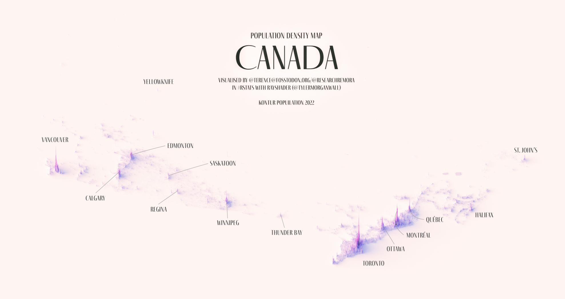
The reason I saw the post though was that someone was pointing out how many of Canada's dense cities are in a straight line and would be perfect for high-speed rail. While 3D map datavizzes like these can be more of a flashy piece of art than a helpful graphic if you're not careful, I still immediately wanted to know how to make one of these maps myself.
Before jumping in here, I want to give full credit to Spencer Schien for the live-coding tutorial that I based this post on. I wanted to try my hand at making it myself, and I thought it would be nice to have instructions in written form if anyone is interested. You can find Spencer's git repo with the code from the video on Github, and the video tutorial below:
The Setup
I'm using Fedora these days and sadly getting everything setup was a bit of a hassle.
I started off by installing R and Rstudio, which was easy thankfully:
sudo dnf install -y R rstudio-desktopThe other R packages depend on a lot of open source tools for geospatial analysis, all of which need to be installed at both the OS level and in R.
To handle all the dependencies on the OS side for this project, in the end I installed all of the following packages:
sudo dnf install -y openssl-devel libcurl-devel libjpeg-devel gdal gdal-devel proj-devel geos-devel sqlite-devel udunits2-develIn R, I installed a couple of my usual packages, along with the remotes package to make it easy to install the rayrender and rayshader packages direct from Github.
 tylermorganwalltylermorganwall
This meant the flow for installing my R packages was something like
install.packages("tidyverse")
install.packages("remotes")
remotes::install_github("https://github.com/tylermorganwall/rayrender")
remotes::install_github("https://github.com/tylermorganwall/rayshader")
Making the Map
First we'll need to download the data. Kontur.io is kind enough to provide population density data. Data is available by country, for this we'll download data for the U.S.. You could navigate to the website and hit download, or you can download the data directly using R:
url <- 'https://geodata-eu-central-1-kontur-public.s3.amazonaws.com/kontur_datasets/kontur_population_US_20220630.gpkg.gz'
destination_file <- 'kontur_population_US_20220630.gpkg.gz'
download.file(url, destination_file, 'curl')
The file is compressed using gzip, so we'll need to unzip the file before we can extract the data we want.
# install.packages("sf")
# install.packages("R.utils")
library(sf)
library(R.utils)

df_pop_st <- st_read(gunzip(destination_file, remove=FALSE, skip=TRUE))
colnames(df_pop_st) <- tolower(colnames(df_pop_st)) # this is just personal preference
To focus in on the DC metropolitan area, we'll need to filter for DC and the counties around it. I spent a bit of time googling what the official definition of the DC Metropolitan area is, but in the end I decided to limit it to the counties and cities that Metrorail runs through.
The tigris package makes it easy to download county and state shapefiles and load them into R.
walkerkeThe counties shapefile doesn't include a state names, so you'll need to get the StateFP codes before filtering on county name, since many states have overlapping county names. Even in the DMV, there's a Montgomery County in both Maryland and Virginia, which will require an extra filter too.
# install.packages("tigris")
# install.packages("tidyverse")
library(tigris)
library(tidyverse)  # need this for filter and ggplot later, but could
                    # just use dplyr for filter and distinct

df_states_st <- states()
colnames(df_states_st) <- tolower(colnames(df_states_st))
statefps <- df_states_st |>
  filter(name %in% c("District of Columbia", "Virginia", "Maryland")) |>
  distinct(statefp)

# Now grab the counties
df_counties_st <- counties()
colnames(df_counties_st) <- tolower(colnames(df_counties_st))
counties_list <- c("Montgomery County", "Alexandria city", "District of Columbia",
                   "Fairfax County", "Loudoun County", "Arlington County",
                   "Prince George's County", "Falls Church city",
                   "Fairfax city"
)

# Pull out DC Area counties and cities and set up the correct CRS for
# mapping later
df_dmv_st <- df_counties_st |>
  filter(statefp %in% statefps$statefp, namelsad %in% counties_list) |>
  filter(statefp != '51' | namelsad != 'Montgomery County') |> # exclude Montgomery County, Virginia
  st_transform(crs=st_crs(df_pop_st))
We should do a quick check before moving forward to make sure it looks like we got it right:
df_dmv_st |>
  ggplot() +
  geom_sf()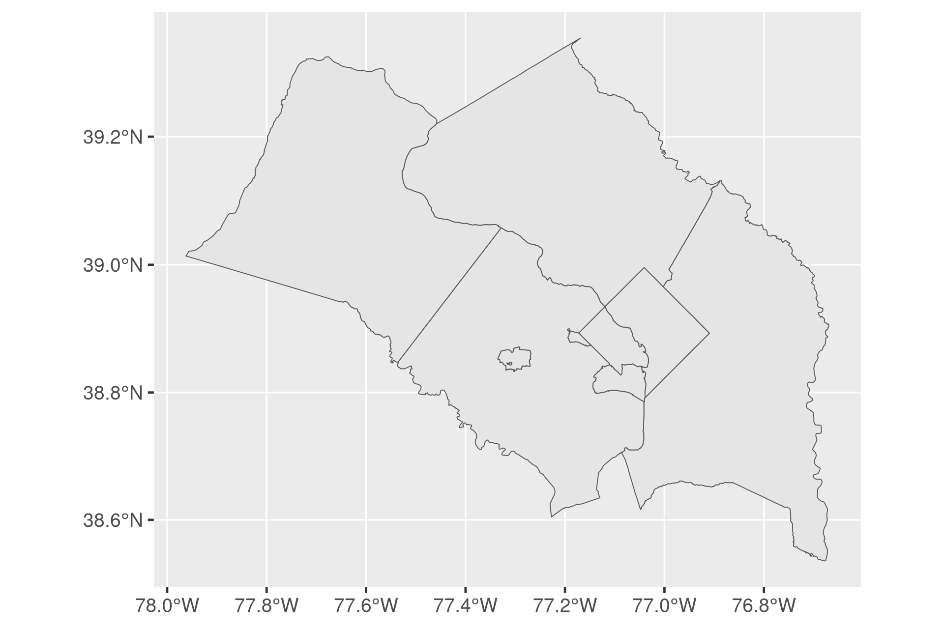
Looks good!
Building a 2D Heightmap Matrix
Rayshader works by taking in a 2D Matrix where each value corresponds to the height it should render. To create this 2D matrix, we'll need to rasterize the population hexagons so we can generate the matrix.
The size parameter will dramatically affect RAM usage and runtime, so I recommend starting with a smaller number (500-1000) while setting up your render.
size <- 1000

dmv_rast <- st_rasterize(df_pop_dmv_st,
                         nx = floor(size * w_ratio),
                         ny = floor(size * h_ratio))

mat <- matrix(dmv_rast$population,
              nrow = floor(size * w_ratio),
              ncol = floor(size * h_ratio))
Choosing Colors
The last thing we'll need are colors for the visualization. The original tutorial I linked relies on the Metbrewer package which pulls color palettes from famous paintings in the Metropolitan Museum of Art. This is a really cool concept, and I know this visualization is meant to be more cool than anything else, but for dataviz I still like using the old classics.
I'm not sure if it's what @terence@fosstodon.org used, but I usually default to using ColorBrewer2 for visualizations most of the time. Based on a training I took with the amazing Ann K. Emery through work, when it comes to using sequential gradients it's usually best to have the darker color indicate larger values. Terence's palette looks like PuRd, and I given the blog's color themes you can probably guess I like Purple too. It's not critical, but if you want to visualize the colorpalette before creating the visualization, you can use the colorspace package.
The RColorBrewer package sticks to the palettes you can pull from the website, so to create a smooth gradient we'll need to use the colorRampPalette function.
# install.packages("RColorBrewer")
# install.packages("colorspace")
library(RColorBrewer)
library(colorspace)
colors = brewer.pal(n=9, name = "PuRd")

texture <- grDevices::colorRampPalette(colors, bias = 3)(256)
swatchplot(texture)
Drafting the Render
Since R doesn't have GPU support to crank out rayshaded renders quickly, we'll want to set up the visualization with low quality settings before the final render.
library(rayshader)

rgl::close3d() # Close

mat |>
  height_shade(texture = texture) |>
  plot_3d(heightmap = mat,
          zscale = 20,
          solid = FALSE,
          shadowdepth = 0)
render_camera(theta = -15, phi = 50, zoom = .7)
rgl::rglwidget() # Required to show the window in an RStudio NotebookThe plot_3d function has a ton of features to experiment with, these are just the ones I landed on.
After zscale, the render_camera() function specifies where the camera is placed in the scene. theta is the rotation angle in degrees (imagine looking down at a compass), phi is the azimuth angle, and zoom controls how much the camera is zoomed into the scene. Other scenes will definitely need different values here.
Once you've dialed in the camera and zscale settings, it's time to dial in the render settings.
Rendering time seems to scale primarily with the number of samples, the min_deviation, and the number of pixels out. So we'll leave those at the default to make sure the lighting for the scene looks good.
render_highquality(
  filename = "test_plot.png",
  interactive = FALSE,
  light = TRUE,
)
Once the scene looks good, it's time to set up the final render.
A word of caution, this used an immense amount of RAM, so make sure you have SWAP setup if you're using Linux. With nothing else running in the background, my Fedora 37 desktop chewed through about 58 GB of RAM.
Once it finishes running, you should have a (very large) beautiful render!
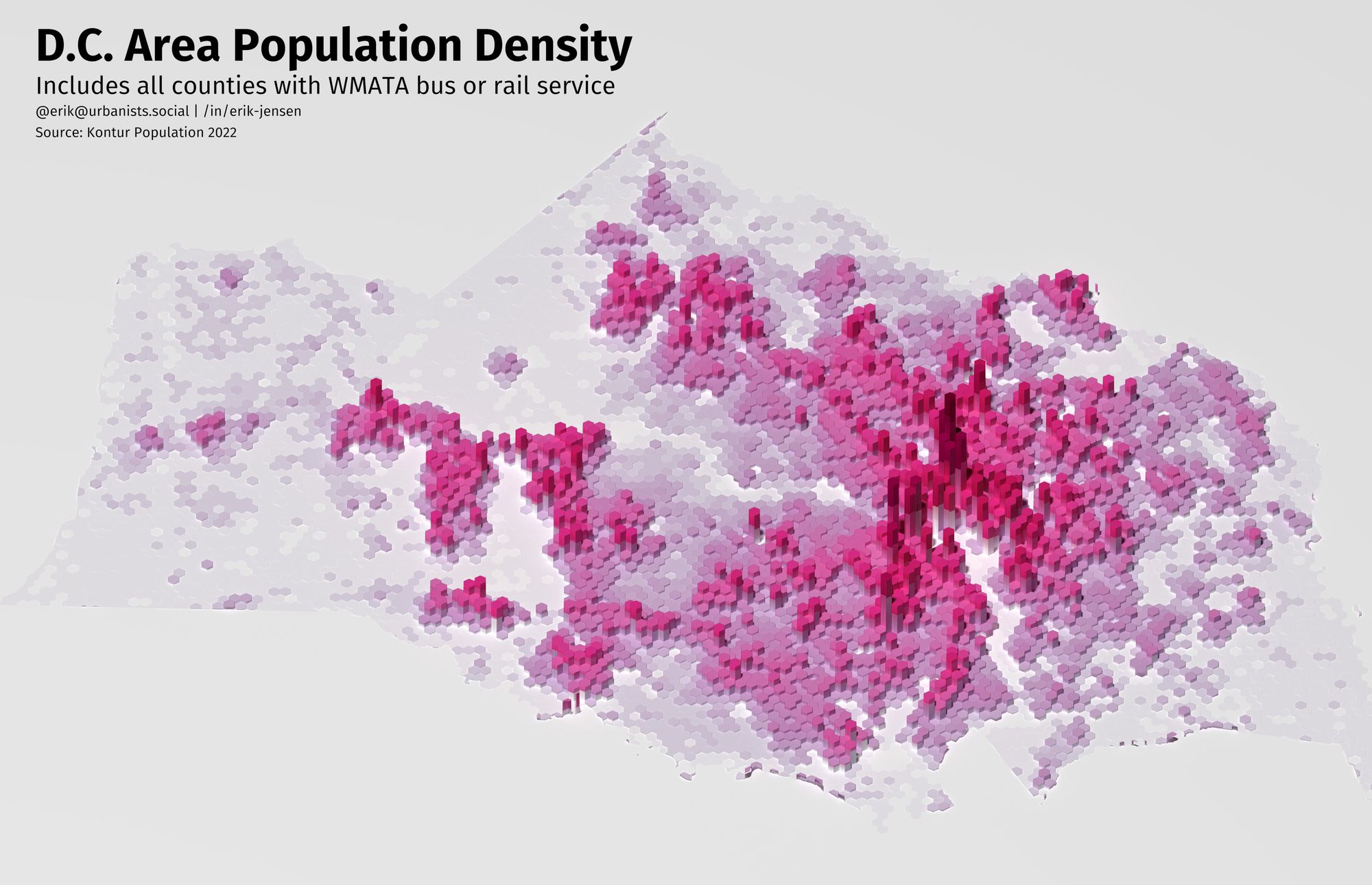
Marking Up the Render
We have a beautiful image, but it's even more important with a visualization like this to mark up the map to help readers. Even local readers won't be able to rely on parks, rivers, or transit to ground themselves.
To make these annotations, we'll use the magick package in R. If you're building the package from source on Linux, you'll need to follow the instructions on the magick web page for installing ImageMagick. On Fedora 37, I ran:
sudo dnf install ImageMagick-c++-develImageMagick is an amazing utility and the magick package leverages this open source tool to modify images using an R programming interface. Most of the functions have a corresponding function in ImageMagick, and it may be helpful to check out the ImageMagick documentation as well.
# install.packages("magick")
library(magick)

# Read in the image
img <- image_read("test_plot (1).png")
Putting in cities is somewhat difficult since we're just picking spots on the image manually. I worked at it for awhile, but eventually decided it was taking too long trying to work within the constraints of the magick library and gave up before fully learning how to use ImageMagick from teh command line.
Now that we have a sense of where all the local cities and towns are, let's get to annotating the map:
img |>
  image_crop(gravity = "center",
             geometry = "8000x5000+250-250") |>
  image_annotate("D.C. Area Population Density",
                 gravity = "northwest",
                 location = "+200+100",
                 color = "#000000",
                 size = 260,
                 weight = 700,
                 font = "FiraGO"
                 ) |>
  image_annotate("Includes all counties with WMATA bus or rail service",
                 gravity = "northwest",
                 size = 140,
                 location = "+200+400",
                 font = "FiraGO") |>
  image_annotate("@erik@urbanists.social | /in/erik-jensen",
                 gravity = "northwest",
                 size = 80,
                 location = "+200+580",
                 font = "FiraGO") |>
  image_annotate("Source: Kontur Population 2022",
                 gravity = "northwest",
                 size = 80,
                 location = "+200+700",
                 font = "FiraGO")
After all that, we get this image out (which I converted to JPEG to save on disk space for the blog post):

Was it worth it?
While I do think there's some opportunity to use this technique to create informative data visualizations, in general I think this type of 3D map mostly serves to frame an issue before diving in more deeply with more traditional charts as part of a presentation.
The long render times and instability on my laptop and desktop running Fedora also meant I didn't experiment with making it more artistic, something I think Terence did really well.
I've talked with coworkers over the years about creating a "day in the life of a bus" visualization, and I think this rayshader + rayrender approach could work really well with a GIS trajectory and building heights. Maybe a good topics for a future blog post.