Recreating FiveThirtyEight's Footer
FiveThirtyEight's charts are some of the most memorable data visualizations in the world and several people have put a lot of effort into recreating their style. While FiveThirtyEight keeps their actual ggplot2 themes private, Max Woolf and Austin Clemens both created their own versions of the real
theme. As Reddit will tell you though, it was not immediately obvious how to make the footer with the FiveThirtyEight logo and data source on it with ggplot2. Now I am relatively certain they just use Adobe Illustrator to add on the footer every time, but I decided to see whether I can do it using R.
Plotting U.S. VMT
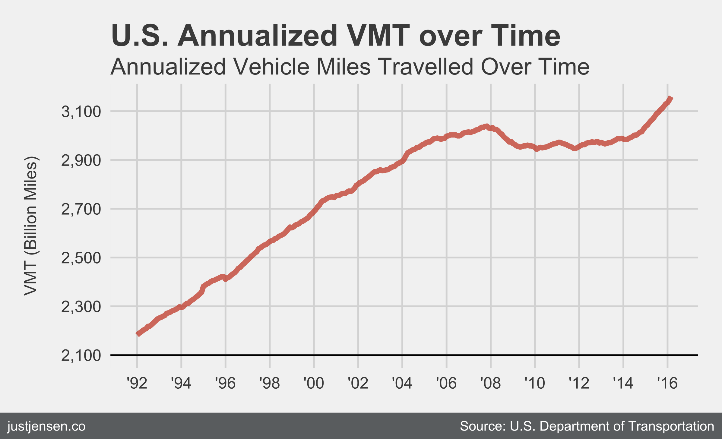
Since I'm a transportation nerd and analyst, we'll start by creating a plot of Annualized Monthly Vehicle Miles Traveled (VMT) over the last 20 years in the United States. (Since) I got the data set from the federal [DoT], we'll start by cleaning it up a little bit. The dates need to be in a standardized format, so we'll start with that.
Cleaning up the data
setwd('<my working directory>')

df.vmt <- read.csv(file='USVMT2016.csv')  # Reading in the data
names(df.vmt) <- c('Year', 'VMT')         # Changing the names

# Reformatting the dates
df.vmt$Year.POSIXct <- as.POSIXct(df.vmt$Year, format = '%m/%d/%y')
Creating the plot
Moving on, let's make the plot of VMT. This isn't meant to be a
primer for ggplot2, so check out some tutorials online if you are curious. While the the bloggers above made their own 538 themes, I am just going to use ggthemes for most of the styling.
# All the necessary libraries from CRAN
library(ggplot2)
library(RColorBrewer)
library(ggthemes)
library(scales)
library(grid)

plt.vmt <- ggplot(df.vmt, aes(Year.POSIXct, VMT)) +
  # Making x-axis look good
  scale_x_datetime(labels = date_format("'%y"),
                   breaks = date_breaks("2 years")) +

  # Making y-axis look OK
  scale_y_continuous(labels=comma, breaks=seq(2100,3200, by=200)) +

  # Creating a dark line at the bottom of the graph
  geom_line(size=1.5, alpha=0.75, color="#c0392b") +
  geom_hline(yintercept=2100, size=0.4, color="black") +

  # Labeling the axes in case you want to use the last line
  ylab('Vehicle-Distance Traveled (Billion Miles)') + xlab('Year') +

  # Adding the title
  labs(title='U.S. Annualized VMT over Time') +

  # From ggthemes, making it look like 538
  scale_color_fivethirtyeight(df.vmt) + theme_fivethirtyeight() # +
  # theme(axis.title = element_text())  # only add this is you want axis
                                        # labels

# Displaying the plot
plt.vmt

If you do not want to adhere strictly to 538's attractive but annoying
choice of putting the axis labels in the subtitle, then uncomment
+ theme(axis.title = element_text()) at the end.
Adding the Subtitle
It looks like the next version of ggplot2 is going to include a subtitle option thankfully, so I won't go into too much detail here. I used the function from hrbrmstr's blog post. I only needed to write a couple of lines of R code myself, but the plot could probably use a label on the y-axis to make things a little clearer.
subtitle <- 'Annualized Vehicle Miles Travelled Over Time'
ggplot_with_subtitle(plt.vmt, subtitle, '', 14)

Adding the Footer
I want to point out that this method is somewhat inflexible, and you are almost certainly better served firing up Adobe Illustrator or [Inkscape]. 538 has two styles of footer, and this is the less common one. This requires the library gridExtra and you should make sure you have the current version (3.3.1 as of posting). Essentially, we have to create a second plot below the first (it is a little hacky). Using grobTree, the rectGrob is the background fill and the two textGrob objects are my website and data source.
grid.newpage()
text.Name <- textGrob('  justjensen.co', x=unit(0, 'npc'),
                      gp=gpar(col='white', family='sans', fontsize=8),
                      hjust=0)

text.Source <- textGrob('Source: U.S. Department of Transportation  ',
                        x=unit(1, 'npc'), gp=gpar(col='white', family='',
                                                  fontsize=8),
                        hjust=1)
footer = grobTree(rectGrob(gp=gpar(fill='#5B5E5F', lwd=0)), text.Name,
                  text.Source)

plt.final <- grid.arrange(plt.vmt_sub, footer, heights=unit(c(0.94, 0.06),
                                                            c('npc', 'npc')))

Overall, I think the final plot looks good and fairly close to the 538 footer. They use fonts that are behind a paywall, so I used the standard fonts. Adding in an SVG or PNG using ggplot2 is not the easiest either, so I decided to ignore it for now. If the SVG is not rendering properly, there is a PNG file below. The PNG has the y-axis on it, since I thought it was necessary to really explain the units.
All code, as well as the markdown for the blog post, can be found on my GitHub page.